

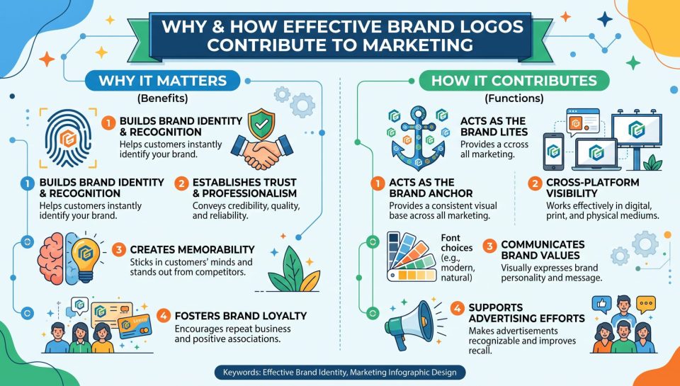
Why and How Effective Brand Logo Contributes to Marketing
A great logo isn’t “just a graphic.” It’s a fast, repeatable signal that helps people recognize your business, remember it, and trust it across every marketing channel. Why and How Effective Brand Logo Contributes to Marketing: it strengthens brand recall, makes campaigns more consistent, improves perceived credibility, and supports long-term brand equity.
Your logo appears everywhere—website, packaging, social profiles, ads, invoices, email signatures, app icons, and more. Each time people see it, they form (or reinforce) an impression. Done right, your logo becomes a shortcut to your brand promise and a tool that makes your marketing more effective.Quick Answer: Why and How Effective Brand Logo Contributes to Marketing
- Builds instant recognition in crowded markets
- Improves trust and credibility at first glance
- Creates consistency across ads, social media, email, and packaging
- Communicates brand personality through color, type, and shape
- Reduces marketing friction by making your business easier to remember
- Grows brand equity over time as customers connect the logo with experience
The Role of Logo in Brand Strategy (And Why It Matters)
To understand why and how effective brand logo contributes to marketing, you need to see the logo as part of a system—not a standalone piece of art. The logo is a visual identifier, but in marketing it becomes a strategic tool that supports how your brand is perceived and remembered.
A Logo Acts as a Memory Hook
People scroll fast and make decisions quickly. A recognizable logo helps your brand stick in someone’s mind even when they don’t buy right away. When they see your logo again—on an ad, a post, or a product page—it triggers familiarity.
A Logo Reinforces Positioning Without Words
Your logo can quietly say “premium,” “friendly,” “modern,” or “traditional” before the customer reads a single line of text. Shapes, typography, and color choices influence perception—especially for first-time buyers.
A Logo Creates Consistency That Compounds
Marketing works best when every campaign looks like it comes from the same business. The logo is the anchor that connects all marketing assets. Over time, consistent exposure builds stronger brand recall and trust.
Why and How Effective Brand Logo Contributes to Marketing Across the Funnel
A logo supports more than awareness. It can influence every stage of the marketing funnel—from discovery to loyalty.
Awareness: First Impression and Visibility
When someone sees your brand for the first time, your logo helps them decide if you look legitimate and relevant. A blurry, confusing, or outdated logo can weaken trust instantly.
A good logo helps with:
- Social media profile recognition
- Ad creative credibility
- Search and marketplace visibility
- Packaging that stands out on shelves
Consideration: Trust and Comparison
In the consideration stage, people compare multiple brands. Your logo helps them remember which one they saw yesterday or on a competitor’s page. A professional look signals stability and makes people more confident.
This is one of the strongest reasons why and how effective brand logo contributes to marketing: it supports trust while people are deciding.
Conversion: Reducing Doubt at the Moment of Action
At checkout, in a proposal, or on a contact form, customers want clarity and reassurance. Consistent branding—especially the logo—helps people feel they are still dealing with the same brand they researched.
Key conversion touchpoints:
- Website header and checkout pages
- Email confirmation and invoices
- Sales pages and landing pages
- Proposal documents and PDFs
Retention: Identity and Loyalty Over Time
Over time, your logo becomes connected to your customer’s experience. If you deliver real value, the logo becomes a symbol of trust. That’s why large brands protect their logos—because they represent years of customer relationship-building.
Importance of Logo Design in Marketing (It’s Not Just About Looks)
The importance of logo design in marketing goes far beyond visual beauty. Effective logo design is about communication, usability, and consistency.
Logos Must Be Recognizable at Small Sizes
Today most people see your brand on mobile. If your logo has too many details, thin lines, or complex gradients, it will fail in:
- Favicons
- Social profile circles
- App icons
- Mobile ads and thumbnails
Logos Must Be Versatile in Many Formats
Your marketing uses different backgrounds and formats. A strong logo should work in:
- Full color
- One color
- Black-and-white
- Light and dark backgrounds
- Horizontal and stacked layouts
Versatility saves time and makes content creation easier. That’s another practical reason why and how effective brand logo contributes to marketing.
Logos Must Match Brand Personality
A logo doesn’t need to show exactly what you sell, but it must “feel right” to your audience. A luxury brand and a kids’ toy brand should not look the same—and customers notice.
Logos Should Be Protectable
If your business is growing, your logo becomes an asset. Avoid designs that are too generic or too similar to competitors. A unique design can be easier to protect as a trademark and helps you stand out long-term.
What Makes a Logo Effective? A Practical Checklist
Use this checklist to evaluate your current logo or brief a designer.
1) Simplicity
Simple logos are easier to remember and reproduce. They also look cleaner across all marketing platforms.
Ask yourself: Can someone recognize it in one second?
2) Distinctiveness
If your logo looks like every other business in your niche, it won’t help your marketing.
Ask: Would people confuse it with a competitor?
3) Relevance
Your logo should match your business category and target audience expectations.
Ask: Does it feel aligned with what we offer and who we serve?
4) Scalability and Legibility
A logo must work on tiny icons and large banners.
Ask: Does it still look clear at 32px size?
5) Consistency With Brand Elements
A strong logo fits naturally with your:
- Brand colors
- Typography
- Image style
- Tone of voice
Logo vs Brand Identity vs Brand Strategy (Know the Difference)
Many people think the logo is the brand. It’s not. Here’s the difference.
| Element | What it is | How it helps marketing |
|---|---|---|
| Logo | Visual mark or wordmark | Recognition, trust, consistency |
| Brand identity | Visual system (colors, fonts, layouts) | Cohesive campaigns, stronger presentation |
| Brand strategy | Positioning, messaging, audience, promise | Guides what you say and why people choose you |
The importance of logo design in marketing is highest when the logo supports a clear brand strategy and identity system.
How to Use Your Logo in Marketing (Without Overdoing It)
Even a great logo can lose impact if used incorrectly. You need consistent rules.
Create a Simple Logo Usage Guide (Mini Brand Kit)
You don’t need a huge brand book. A one-page guide works well.
Include:
- Primary logo
- Secondary (stacked) logo
- Icon-only version
- Monochrome versions
- Safe space rules
- Minimum size rules
- Color codes (HEX/RGB/CMYK)
- Do’s and don’ts (no stretching, no random colors)
Apply Logo Consistency in High-Impact Places First
Start where people see you most:
- Website header and favicon
- Social profile images
- Email signature and newsletter header
- Product packaging or labels
- Ad creatives and video end cards
This rollout strategy is exactly why and how effective brand logo contributes to marketing—because it increases consistent exposure.
Don’t Use a Logo as a Substitute for a Message
In ads and content, the logo supports the message—it doesn’t replace it. Pair the logo with:
- Clear headline
- Value proposition
- Simple call to action
Color, Typography, and Shapes: What They Signal in Marketing
Design elements affect perception. While it’s not magic, it’s real communication.
Color Builds Recognition
Consistent brand color use helps customers identify your brand quickly. Use a limited palette and keep the same color codes across all designs.
Tips:
- Choose 1–2 primary colors
- Use strong contrast for readability
- Test on mobile and dark mode
Typography Communicates Personality
Fonts create a “voice”:
- Sans-serif often feels modern and clean
- Serif can feel classic and authoritative
- Script can feel personal, but may reduce readability
Shapes Create Emotional Tone
- Rounded shapes feel friendly and approachable
- Sharp angles feel bold and energetic
- Symmetry feels stable and reliable
These signals support the role of logo in brand strategy because they communicate positioning instantly.
When Should You Redesign Your Logo?
Redesign is not always needed. But sometimes it’s the right move.
You should consider an update if:
- Your logo looks outdated in your market
- It’s hard to read on mobile
- You expanded your services or changed audience
- Your branding looks inconsistent everywhere
- You don’t have proper files for marketing and print
Refresh vs Rebrand
- Logo refresh: small improvements (spacing, simplification, updated font)
- Full rebrand: strategy + identity system changes
If your business already has recognition, a refresh often keeps trust while improving usability.
Common Logo Mistakes That Hurt Marketing
These mistakes weaken brand memory and make marketing look unprofessional:
- Too much detail
- Low contrast and poor readability
- Trend-chasing designs
- No icon version for small uses
- Multiple inconsistent versions
- Missing vector files (SVG/AI/EPS)
Fix: keep one official folder with approved files and a short usage guide.
My Experience: Real logo marketing experience
Last month, I worked on a branding and marketing project for a telecom company in Bangladesh that introduced a new logo called “Cirkle.” The project is planned for 6 months, and my role covers logo design support, brand identity setup, and marketing execution to help the new logo gain recognition and customer trust.
At the beginning, the main challenge was simple: the company had a new name and logo, but the market didn’t recognize it yet. So we focused on making the logo visible and consistent everywhere customers interact with the brand. I prepared a basic brand kit (logo versions, colors, typography, spacing rules) and ensured the “Cirkle” logo was used correctly across key touchpoints—social media, banners, service posters, and digital creatives. This matters because when people see the same logo repeatedly in the same style, they remember it faster and start trusting it as a real, stable brand.
Next, we aligned the branding with the marketing message. Instead of just posting the logo, we built creatives that combined the logo with clear offers, short benefits, and a consistent visual layout. That way, the logo wasn’t only “decoration”—it became a signature that stamped every campaign with the same identity. We also kept the logo readable on mobile and made sure it worked in different formats (full color, single color, and icon-style use for profile images).
Even within the early stage of the 6-month plan, I noticed a clear pattern: once the “Cirkle” logo started appearing consistently across posts and promotional designs, people began recognizing it faster and engaging more confidently with the brand. This is exactly how a logo contributes to marketing in real life—it creates familiarity, and familiarity helps marketing efforts convert better over time.
If you want, tell me:
- the telecom company’s main service (SIM, internet, packages, etc.), and
- where you marketed most (Facebook, offline banners, YouTube, shops)
—then I can rewrite this experience section to sound even more specific and stronger while staying truthful.
Global Marketing Perspective: Why Logo Versatility Matters Worldwide
Because your audience is global, your logo should work across different cultures, languages, and platforms.
Global-friendly logo tips:
- Avoid symbols that can be confusing in other cultures
- Keep an icon-only version for apps and marketplaces
- Ensure readability even when your brand name is unfamiliar
- Use a consistent logo system across all regions
This is another reason why and how effective brand logo contributes to marketing: it helps you scale faster without redesigning every time you enter a new market.
Step-by-Step: Build a Marketing-Ready Logo System
If you want a practical process, follow this:
- Audit every place your logo appears (website, social, ads, email)
- List the biggest problems (blur, unreadable, inconsistent colors)
- Define brand traits (3–5 words like “modern, friendly, premium”)
- Create versions: full logo, stacked, icon-only, monochrome
- Write simple rules: spacing, sizes, colors, do/don’t examples
- Export correct files: SVG, PNG, PDF, and source vector
- Update your top touchpoints first (website + social)
- Maintain consistency using templates for posts and ads
That system turns your logo into a marketing asset that supports long-term growth.
Frequently Asked Questions
Why and how effective brand logo contributes to marketing results?
A strong logo increases recognition and trust, making your marketing look consistent across channels. Over time, people remember your brand faster, which reduces friction and helps your campaigns perform better—especially in competitive markets.
What is the importance of logo design in marketing for small businesses?
For small businesses, a logo is a credibility tool. It makes your brand look established, improves memorability, and ties together your website, social media, and promotional materials—helping you compete with bigger brands.
Should my logo show exactly what I sell?
Not necessarily. Many successful logos are abstract or text-based. The most important thing is that it feels relevant to your audience, is easy to recognize, and stays clear at small sizes.
How often should a logo be updated?
Only update when there’s a real reason: outdated look, poor mobile readability, expansion into new services, or inconsistent versions. Many brands prefer a small refresh instead of a full redesign.
What file formats are required for marketing?
You should have SVG (web), PNG (transparent background), and PDF (print). If possible, keep the original vector file (AI/EPS) so you can scale the logo without losing quality.
Can a logo improve SEO directly?
A logo doesn’t directly increase rankings, but strong branding can improve user trust and engagement. That can support marketing performance and make people more likely to click and return.
Final Thoughts
Your logo is one of the most repeated signals in your marketing. When it’s distinctive, consistent, and usable across platforms, it builds recognition and trust that compound over time. That is why and how effective brand logo contributes to marketing—by turning every touchpoint into a reinforcement of your brand identity.
Want help improving your branding consistency and marketing performance? WhatsApp me at 01957533749 and tell me your business type and what you want to achieve.
Hello, I am MD Morsalin. I am an SEO expert and content writer. I have been writing content for 5 years and have had 30+ websites approved by Google AdSense. I am a professional writer.
